Setting type has been an occupation and a passion of mine over the last 30 years. After completing some schooling at Cooper School of Art in Downtown Cleveland I accepted a position at Peto's Type House. Back then, the Cleveland Press still set type with 'Hot' lead. I know, I know, this dates me, but the facts are the facts. PhotoType was in it's infancy with the Linotronic 5700 being top-of-the-line technology in Photo type setting. My job at Peto's was more modest, among other things, I was hired to set headline type on what was called a 'Typositor'. It was still photo type setting but for headlines only. Letters had to be set (exposed), one letter at a time. A single headline of lets say15 words or so could take an hour or two to completely finish for paste-up, that's right, I said paste-up. That should really date me!! By doing this day in and day out (for hours on end) I gained a "close-up' appreciation for letterforms and spacing. Ernie Peto would also quiz me on identifying type by name. It was an interesting 18 months to say the least. There have been lasting effects on my appreciation of letterforms thanks to this experience.
Over the years, there have been spin offs of wood type, Times Roman, Helvetica, etc. Seems to me like we are just going over the same ground over and over and over again. What interests me is not the 'sameness' in the letterforms or their 'invisibility' in the graphics world. Some fonts are used to be 'invisible'. What I mean by this is that they are merely a communication tool to deliver the authors' / writers' message. the artistry in the forms lies in their ability to stay invisible and be easy to read.
But their 'uniqueness' and how that difference translates to the printed page. There are many ways of looking at letterforms. We can look at the beauty of the individual letters themselves. Commenting on the curves of a upper case 'A' or a lower case letterform. Or we can look at them as a 'unit' and how that translates within a block of written text. It is this uniqueness that I am looking for in the fonts I design. More...
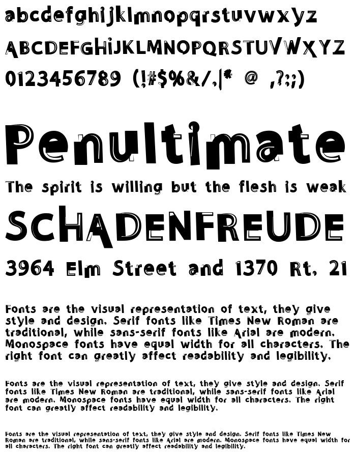
I do look at each individual letterform and revel in the beauty of the forms and lines. But I also want to create a Font that when written out will display some unusual and unexpected characteristics when in a large block of text. Look for different line weights and forms in my font glyphs. The idea here is to allow the printed page to display uniqueness in contrast.
Variants
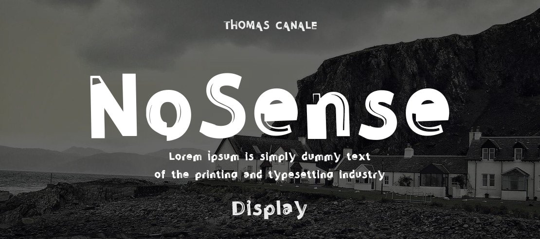
NoSense NoSense


Image Generator:
Customize and Visualize Your Texts!
Image Generator is a captivating service that empowers you to unleash your creativity by fully customizing your texts and visualizing them in a wide range of formats. This impressive tool puts you in control, allowing you to fine-tune font styles, sizes, background and font colors, as well as the text content itself.
With Image Generator, you can create mesmerizing texts by customizing the background and font colors to your heart's desire. Choose your favorite colors or explore diverse color palettes to achieve captivating color harmonies that truly reflect the essence of your projects or brand.
Image Generator provides outputs in SVG and PNG formats, tailored to your preferences. The SVG format preserves the quality of your texts as vector-based graphics, ensuring no loss of detail or sharpness when resizing. On the other hand, the PNG format delivers high-quality raster images, enabling you to showcase your designs flawlessly on websites, social media platforms, or printed materials.
Get ready to captivate your audience with Image Generator, where your imagination has no limits and your texts become works of art.
License
©THOMAS CANALE, CANALE STUDIO, INC.
Similar Fonts
Candal
Added by yundt.breana (1 Style)
Alexander Display
Added by Berta O'Reilly (1 Style)
Faishal
Added by yreinger (1 Style)
i Image of Night
Added by Tristian Cormier (1 Style)
Yippie Yeah
Added by Ward Schaden (1 Style)
Crowded lines
Added by annabell75 (1 Style)


