Syne
Syne is a 5-style type family originally designed in 2017 for the art center Synesthésie, based in Saint-Denis in the very close suburb of Paris, France. Used across their identity, print and screen, Syne has been released under open-source license in June 2018.
An unexpected journey When changing direction in 2016 and going from a 90âs-imprinted digital art center to a forceful and socially-involved structure, Synesthésieâs team felt the need for a visual and conceptual breakaway in their visual identity. We got in contact with them in December 2016 when we were just finishing one of our first workshops â Gutenbug, organised in Paris â where we hacked inkjet printers and tried a different way of looking at a daily tool by using it in unexpected manners. We immediately connected around the ideas of accepting errors, fighting standardisation and creating interesting circumstances more than finished products. Then, although Bonjour Monde was first created to explore unconventional processes only through workshops, we started our first and only commissioned project. Syne is one of its outcomes. Closely based on the art centerâs teamâs will to gather diverse artistic personalities to create fresh and enriching situations, the type family is an exploration into atypical associations in weights and styles.
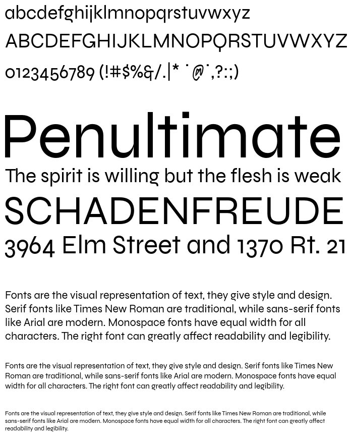
Regular, a geometric Trojan horse As we started sketching, something became prominent: we wanted the type to be new and strange, to respect both Synesthésieâs and our own beliefs, but also not to be subversive by throwing down all predefined codes and rules. Just like the art center is proceeding within standard institutions and spheres, we thought Syne should have one foot in the conformity by having a rather conventional Regular weight which would give the team a practical typeface for their daily use while making the rest of the family even more uncanny. We kept in mind the work of French writer Victor Hugo who wrote revolutionising plays using alexandrine and other traditional canons to defy the Classics on their own ground. Syne Regular is a geometric sans, inspired by many standards of the genre but presenting quite condensed vertical proportions â short ascenders, descenders and uppercases â for a study yet pleasant feeling in longer texts. It also features minimalistic diacritic marks, reduced to the simplest form to only signify a presence.
Bold & Extra, design space as a playground Synaesthesia â or synesthésie in French â is a phenomenon in which different kinds of stimulations get associated in the brain, such as sounds evoking colours. The weight system in Syne is thought as a take on synaesthesia in the type design field as well as a kind mockery regarding the more and more complex design spaces and the seemingly infinite possibilities offered by the recent Variable Fonts format. When getting bolder, all the way to the dramatic and Eurostile-inspired Extra style, the type gains in width, drastically limiting the spectrum with this abnormal association and forcing radical graphic design choices. It is after all one of the strengths of custom-made type that, because it has been created knowing how it would be used, it does not have to care about pleasing everyone or fitting each and every situation, but can focus on conveying a strong identity without compromising. And it is also why we are curious and find it very interesting and important to release Syne to the public.
Italic & Mono, two vector-twisted companions Both styles, side-kicks to a central Roman, carry deep scars of the tools that produced them, as to point out their inherent Bezier substance. The Italic shares its x-height and optical weight with the Regular, but draws its structures in flourished Renaissance types such as Robert Granjonâs and its peculiar flavour in the made-up exercise of trackpad-calligraphy. It is an hommage to yesterdayâs masters using one of the most common gesture-based interfaces of today. The Mono cut is built upon the Regular but has been strongly distorted with DataFace, a little program we made based on the classic FontTools library, that allowed us to automatically switch all on-curve points into off-curve ones and vice-versa. It gives the typeâs contours a unique treatment, mixing arcs and straight lines in a completely unorthodox and vivacious way. Bringing together History and the technical essence of nowadays typography, these two styles both integrated a part of surprise in their design process, a desired lost of control, an acceptance of error to bring out shapes that pure drawing would fail to imagine.
Imagining Syne has been a very exciting exploration, driven both by fun and serious interest in the many questions it raised. We took time to consider not only the importance of a custom type as main vector of an identity, but the meaning of the idea of family in typography. We ended up seeing it somewhat similar to the artistic gesture of Ready-Made, or Found Object, perfected by Marcel Duchamp in the early 20th century: not that the family preexists the designer, but that the mere fact of gathering fonts and calling them âfamilyâ can be most of what makes it a family, more than any objective resemblance. We think of Syne as an assemblage of personalities â they can live all together, in small groups or on their own and will always create a surprising and distinctive visual situation.
â Syne was imagined by Bonjour Monde and designed by Lucas Descroix with help from Arman Mohtadji. The Mono style was distorted using Bonjour Mondeâs DataFace, written by Arman Mohtadji. The Syne family is available with a SIL Open Font License.
Variants
Syne Regular

Syne Mono

Syne Italic

Syne Bold

Syne Extra


Image Generator:
Customize and Visualize Your Texts!
Image Generator is a captivating service that empowers you to unleash your creativity by fully customizing your texts and visualizing them in a wide range of formats. This impressive tool puts you in control, allowing you to fine-tune font styles, sizes, background and font colors, as well as the text content itself.
With Image Generator, you can create mesmerizing texts by customizing the background and font colors to your heart's desire. Choose your favorite colors or explore diverse color palettes to achieve captivating color harmonies that truly reflect the essence of your projects or brand.
Image Generator provides outputs in SVG and PNG formats, tailored to your preferences. The SVG format preserves the quality of your texts as vector-based graphics, ensuring no loss of detail or sharpness when resizing. On the other hand, the PNG format delivers high-quality raster images, enabling you to showcase your designs flawlessly on websites, social media platforms, or printed materials.
Get ready to captivate your audience with Image Generator, where your imagination has no limits and your texts become works of art.
License
Copyright © 2018 by Lucas Descroix. All rights reserved.
Similar Fonts
Co Text
Added by Ryleigh Brekke (3 Styles)
Aliey PERSONAL USE ONLY
Added by hahn (4 Styles)
Croma Sans
Added by bosco.addie (16 Styles)
DelRay
Added by neil (1 Style)


