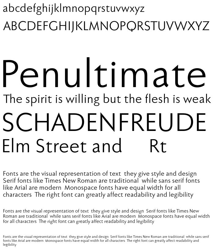
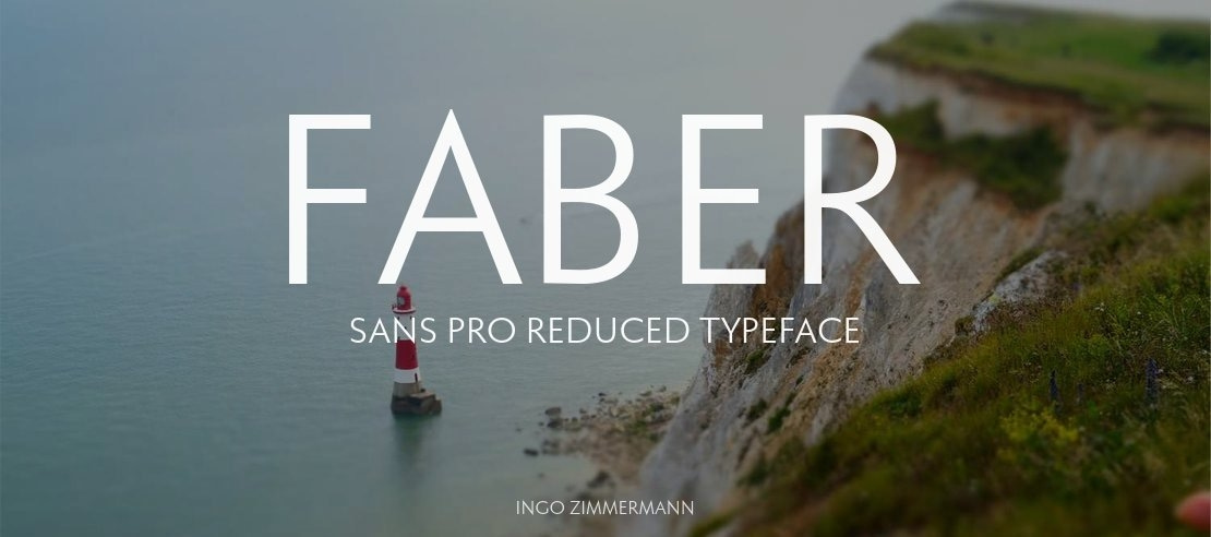
Two fonts in one: a classic-modern sans serif appearing in two forms "standard" and a "stylistic alternate" with uncial script-orientated characters which give the font a completely different "look."
The idea for one of the very first ingoFonts, the sans serif "Faber Eins & Zwei," originated in 1996. This typeface gained popularity over the years, especially in Anglo-Saxon countries. A lot has changed since then not just in font technology. In 2010 it was time for a basic revision of this attractive font, and time to bring it up to date with current font technology. A uniqueness of Faber Sans Pro is that it is actually composed of two fonts. The "basic typeface" is a sans serif in the classic-modern style of type creations of the early 20th century godfathered by Futura from Paul Renner and Gill Sans from Eric Gill. The Roman Capitalis provided the model for the classically proportioned capital letters and the harmonic shapes of the humanistic minuscule for the lower case characters. And so a font with pleasant rhythmic proportions was created and is extremely comfortable to read, especially in large amounts of text; but, it is also reader-friendly under adverse typographic conditions on the monitor.
A "second" typeface with its own personal character resulted as stylistic alternates were designed for the letters a e f g l t u in accordance with the uncial scripts of the late antiquity or rather the early Middle Ages. And the r is given a playful point in the stylistic alternates. Modern OpenType technology makes it possible to combine the previously separate typefaces into one font. The stylistic alternate can be accessed via the OpenType-Functions »Discretionary Ligatures« or also » Stylistic Alternates« (and of course the glyph panel). More...
Unlike classic sans serifs, Faber Sans Pro includes a "true" italic. The italic characters are not simply just slanted variations of the upright, but the characters originated out of handwriting styles; they are rounder and the stroke flow is more fluent than on the upright letters. Some italic letters truly have their very own design which clearly comes from handwriting, particularly noticeable on a and g.
At ingoFonts all fonts can be downloaded. Gratis. Free. Here's the catch: The files offered here to download contain only a reduced font. That means, the font only consists of uppercase and lowercase from A to Z or rather, a to z. The complete font including numerals, umlauts, punctuation and especially ligatures is only available with your order and your cash.
Variants
Faber Sans Pro reduced 55 Normal

Faber Sans Pro reduced 56 Normal Kursiv

Faber Sans Pro reduced 45 Leicht

Faber Sans Pro reduced 46 Leicht Kursiv

Faber Sans Pro reduced 65 Kraeftig

Faber Sans Pro reduced 66 Kraeftig Kursiv

Faber Sans Pro reduced 75 Halbfett

Faber Sans Pro reduced 76 Halbfett Kursiv

Faber Sans Pro reduced 85 Schwer

Faber Sans Pro reduced 86 Schwer Kursiv

Faber Sans Pro reduced 95 Fett


Image Generator:
Customize and Visualize Your Texts!
Image Generator is a captivating service that empowers you to unleash your creativity by fully customizing your texts and visualizing them in a wide range of formats. This impressive tool puts you in control, allowing you to fine-tune font styles, sizes, background and font colors, as well as the text content itself.
With Image Generator, you can create mesmerizing texts by customizing the background and font colors to your heart's desire. Choose your favorite colors or explore diverse color palettes to achieve captivating color harmonies that truly reflect the essence of your projects or brand.
Image Generator provides outputs in SVG and PNG formats, tailored to your preferences. The SVG format preserves the quality of your texts as vector-based graphics, ensuring no loss of detail or sharpness when resizing. On the other hand, the PNG format delivers high-quality raster images, enabling you to showcase your designs flawlessly on websites, social media platforms, or printed materials.
Get ready to captivate your audience with Image Generator, where your imagination has no limits and your texts become works of art.
License
Faber Sans Pro 55 Normal is a trademark of Ingo Zimmermann ingoFont Augsburg.
Copyright (c) 2010 by Ingo Zimmermann ingoFont Augsburg. All rights reserved.
www.ingofonts.com
Similar Fonts
Mophend
Added by kilback.elias (1 Style)
Gangster Grotesk
Added by greyson (3 Styles)
Vera Humana 95
Added by lkrajcik (4 Styles)
Martel Sans
Added by kassulke.mac (7 Styles)
Monkessic
Added by Dagmar Bogisich (1 Style)


