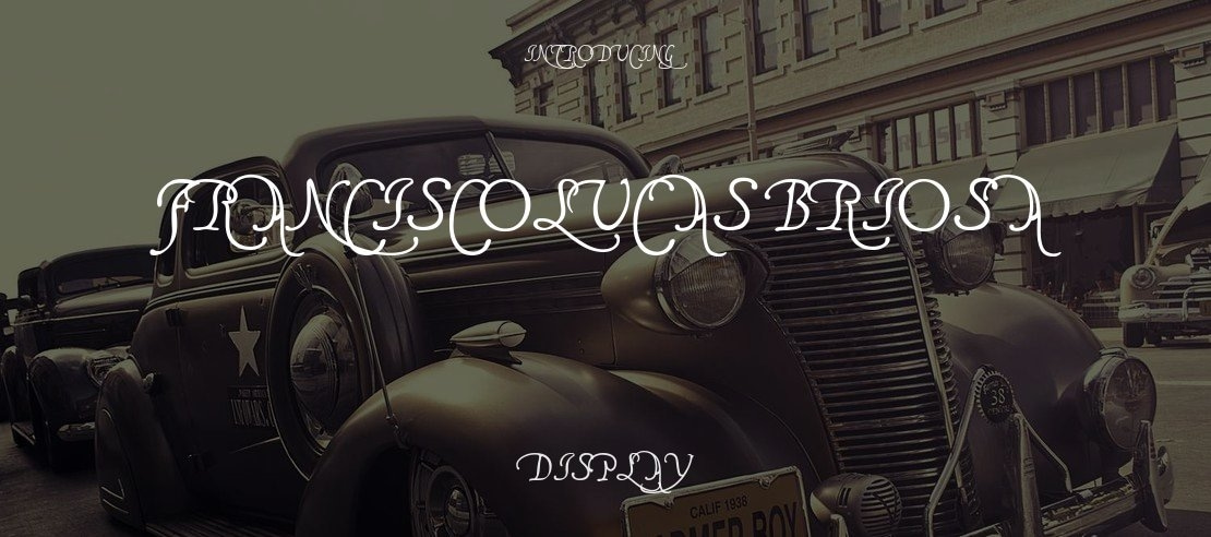
FranciscoLucas Briosa Font Family
Uploaded by kadin 𑁋 Display Typeface

License
Free for personal useDesigner
Pia FraussFranciscoLucas Llana was written at Madrid in 1570, by a man called Francisco Lucas. Employing the Spanish term for a cursive hand, he called it a Bastarda; but technically speaking, it is a humanistic cursive -- the style of writing which is mostly known under the name of Chancery. Reworking Mr Lucas' glyphs has been my first attempt to produce something like regularity; and of course, no Ks and Ws being needed in Spain, I had to dream them up myself.
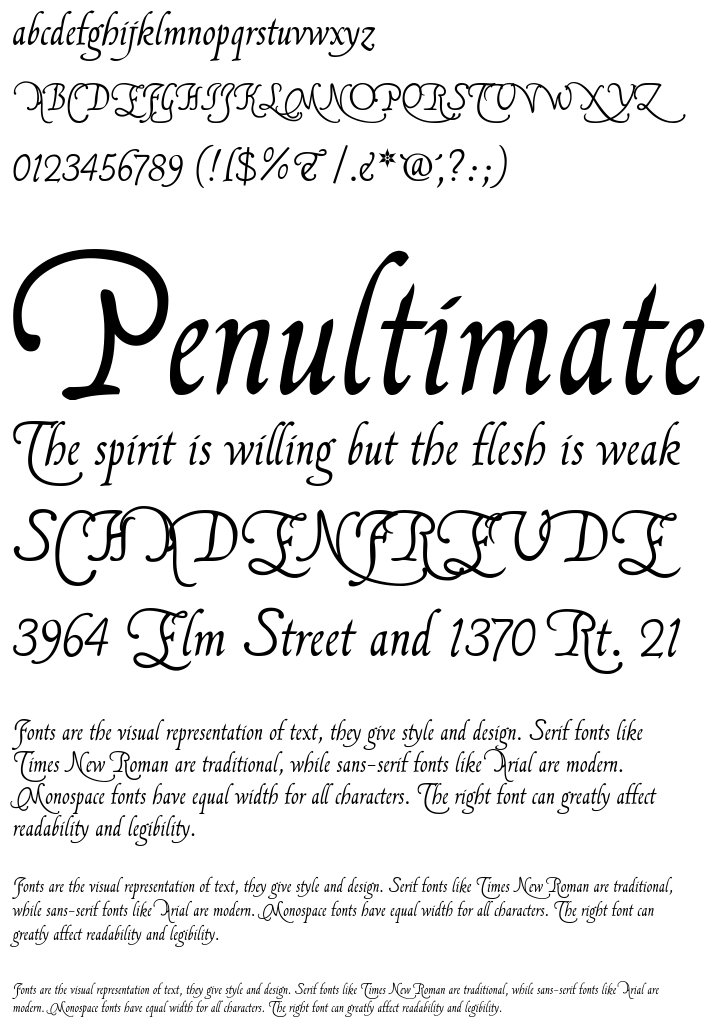
FranciscoLucas Briosa is an alternate and more swashed version of FranciscoLucas Llana, designed after an alphabet of capitals created by the same writing master, and in the same year 1570.
Update 2010 has not only enlarged the dashes and redesigned all of the composite glyphs, in both fonts (and corrected the dcaron, Lcaron/lcaron, and tcaron, of course), it has also given FranciscoLucas Llana a new E, W, g, and y. As a consequence, the alternate glyphs, which were formerly the same in both fonts, are now different.
In FranciscoLucas Llana, you'll find the the following alternate glyphs:
the former g instead of the left bracket
a plain z instead of the right bracket
the former E instead of the left curly bracket
a slender K instead of the right curly bracket
a slender Z on the bar and broken bar sign.
In FranciscoLucas Briosa, you'll find the the following alternate glyphs:
a rather condensed g instead of the left bracket
an alternate y instead of the right bracket
an alternate E instead of the left curly bracket
a very swashed R instead of the right curly bracket
a final e instead of the bar and broken bar sign
Both fonts have a double long s on the long s sign, as well as a st and a ct ligature on the fi and fl keys (in case the fi and fl signs aren't reachable on your computer, you might try the masculine and feminine ordinal indicators, or the 'less-than or equal to', and the 'greater than or equal to' signs). There is no number sign in these fonts. In its place, you'll find a long s.
Update 2007 had reduced the files' size, by redesigning the composite glyphs, and corrected some flaws -- above all, an error concerning the lcedilla sign.
Variants
FranciscoLucas Briosa Regular

FranciscoLucas Llana Regular


Image Generator:
Customize and Visualize Your Texts!
Image Generator is a captivating service that empowers you to unleash your creativity by fully customizing your texts and visualizing them in a wide range of formats. This impressive tool puts you in control, allowing you to fine-tune font styles, sizes, background and font colors, as well as the text content itself.
With Image Generator, you can create mesmerizing texts by customizing the background and font colors to your heart's desire. Choose your favorite colors or explore diverse color palettes to achieve captivating color harmonies that truly reflect the essence of your projects or brand.
Image Generator provides outputs in SVG and PNG formats, tailored to your preferences. The SVG format preserves the quality of your texts as vector-based graphics, ensuring no loss of detail or sharpness when resizing. On the other hand, the PNG format delivers high-quality raster images, enabling you to showcase your designs flawlessly on websites, social media platforms, or printed materials.
Get ready to captivate your audience with Image Generator, where your imagination has no limits and your texts become works of art.
License
If you want to use this font commercially, please visit http://www.pia-frauss.de/imp/cu.htm
Pia Frauss fecit AD MMIII; for private use only
http://www.pia-frauss.de/imp/cu.htm
Similar Fonts
Fairy Strange
Added by cristina89 (1 Style)
Paper Bow DEMO
Added by gregorio.cremin (1 Style)
Quindelia
Added by jamie (1 Style)
Jolly Dream
Added by Roxanne Rippin (1 Style)
British Script
Added by fay05 (1 Style)
Balerina
Added by Filiberto Wyman (1 Style)


